Issue 4 (2007) was a little bit our own "Empire Strikes Back"; it featured a lot of revelations and the bad guys as prominent characters and things were really starting to get dark for the heroes.
I tried to reflect that by pushing the contrast between black and white to the limit with a touch of color. It's the first "design-heavy" cover I did for Marvel, and honestly, I was doubtful this style would be accepted.
It remains one of my favorite covers.
27 July 2010
Immortal Iron Fist #1 cover
When I started doing Immortal Iron Fist #1 cover (2006), I tried to stablish a common design for first whole arc with white prevailing.
It was a new series and I had to think of some trick to make it stand out on store racks. Most superhero comics it would be sharing space with tend to have covers full of elements or rendered in pictorial styles, so I decided to go with large swaths of white. I've been told it worked, everybody knew when a new issue had come out and it could be seen from the entrance to the shop.
This is the final rough, and, as you will notice it was going to be a limited serie.
I inked Iron Fist and K'un-Lun background in two separated boards:
As I did with colors. Incidentally, when I created this cover I still hadn't designed the definitive Iron Fist chest tattoo that would change so much in the interiors and on further covers.
I also designed the logo in such a way that it could be used anywhere on the cover to help the composition. The Chinese characters obviously mean Iron Fist and they change color in each issue.
It was a new series and I had to think of some trick to make it stand out on store racks. Most superhero comics it would be sharing space with tend to have covers full of elements or rendered in pictorial styles, so I decided to go with large swaths of white. I've been told it worked, everybody knew when a new issue had come out and it could be seen from the entrance to the shop.
This is the final rough, and, as you will notice it was going to be a limited serie.
I inked Iron Fist and K'un-Lun background in two separated boards:
As I did with colors. Incidentally, when I created this cover I still hadn't designed the definitive Iron Fist chest tattoo that would change so much in the interiors and on further covers.
I also designed the logo in such a way that it could be used anywhere on the cover to help the composition. The Chinese characters obviously mean Iron Fist and they change color in each issue.
26 July 2010
13 July 2010
Secret Avengers #5
Out in August from Marvel Secret Avengers #5, written by Ed Brubaker with art by Michael Lark and me.
I am working hand to hand with one of my favorite artist these days, not drawing issue as usual, though, I am doing layouts and Michael is finishing pages.
Some work in progress has been shown at CBR in an interview with Marvel's Editors Tom Brevoort and Axel Alonso. Click on Picture to see a four pages preview.
12 July 2010
4th Letter!
Great article by David Brothers at 4thletter.net on my work: 7 Artists: David Aja.
Lots of pictures and really nice words.
Thanks David!
Lots of pictures and really nice words.
Thanks David!
8 July 2010
Daredevil: 3 Jacks
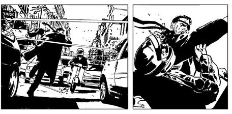
First four pages of 3 Jacks, a short story I did back in 2009 for Daredevil #500, written by Ann Nocenti. Opening scene was a classic fight, Daredevil vs Bullseye. When I was kid I used to re-read once and again all fights between these two in Frank Miller's Daredevil issues. I always wanted Bullseye to win. Yes, I'm evil.
Colors by Matt Hollingsworth.
5 July 2010
Subscribe to:
Posts (Atom)